PROJECT: WAshington State All-payers claims database
The agency I worked with landed a contract to create, from the ground-up, the official Washington State All-Payers Claims Database (APCD) - an online tool you can use to look up the average prices of common medical procedures and compare them across different hospitals and medical groups.
Objectives
My team was tasked with building this thing from the database-up. My role was focused on language and position - how can we make this thing actually usable for normal people who don’t speak insurance jargon?
As the content and UX lead on this project, my key objectives for this web tool were:
Develop a lexicon.
Our primary client product owner was a former doctor, who spoke this jargon fluently and without any awareness around its complete inaccessibility. “Common measures”? “Accountable communities of health”? Huh? The way this underlying data (the CD part of APCD) was structured needed to be heavily translated and transformed into something regular people could digest.
Anticipate frustrations.
We learned very early into the project that APCD experts seemingly all agreed that no APCD had been done well yet. Other APCDs were either unusable, confusing, or just SLIGHTLY trying too hard to be accessible to the point of gross over-simplicity.
Attain a 5th-grade reading level.
For a government tool that aims to inform all Washingtonians, we had to design with broad accessibility in mind. It would be a site that wouldn’t be localized by default either, so the language must also be robot-translator-friendly.
Constraints
The jargon.
It was clear from the outset that there was a lot of work to do for us to become deeply familiar with the abstruse language of insurance and medical claims. We must understand it to transform it into something sensible. For instance, a key failure in other APCD focus groups - typical APCD users don’t find it at all meaningful to differentiate between in-patient and out-patient procedures. And this distinction was a key dichotomy represented in the dataset.
A deeply knowledgeable primary stakeholder.
This constraint is also a strength, but our client product owner was often resistant to simplification, which would sometimes make communication between our teams challenging.
Budget, as usual.
Since this was an entirely new endeavor for the Washington state government, with several interested public sector investors, we had a scrappy “let’s see if this works” kind of budget to work with.
APPROACH
Learn the jargon.
Much of my initial time during our team’s discovery phase was working with my tech lead, both of us diving deep into the underlying data model to understand what exactly we were working with. Together, we’d develop a shared understanding not only of the terminology at play, but how the different types of data played together. (Fun fact - my tech lead and I actually did a talk on our initial data-modeling work at a Drupal meetup! But that was lost to my leaving the agency, sadly.)
Build on those who came before us.
We steeped ourselves in existing research conducted by other states in order to learn lessons from their own APCD adventures. One takeaway became immediately clear - we must completely remove jargon and underlying data structures from initial user considerations, interactions, or choices. Let them use the language that comes naturally for them, and we would do the heavy lifting behind the scenes.
Prototype early, test often.
After our initial discovery and database deep dive, I built out a series of mid-fidelity wireframes focused only on language and key interactions for the first-time user. And I took those prototypes with me everywhere: to bars, to meetups, anywhere where people gathered, performing many informal usability tests as time allowed.
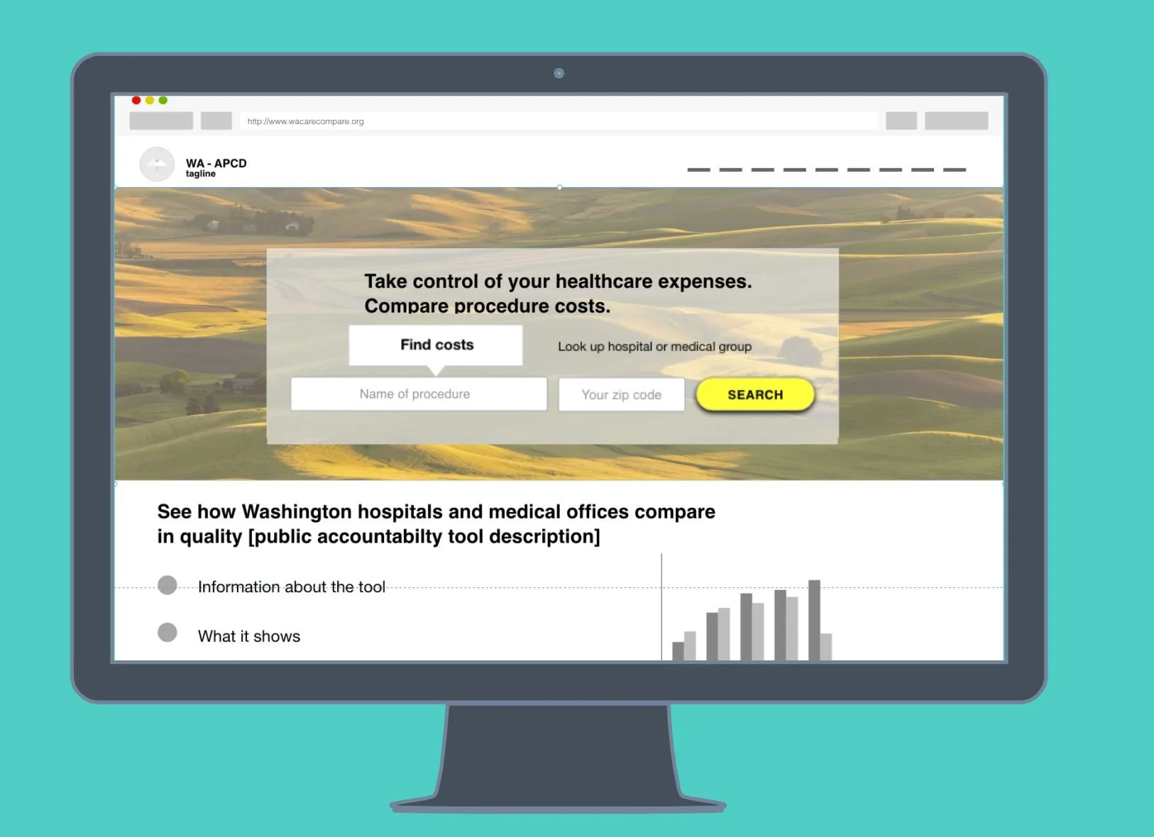
Example of an early wireframe prototype that I created and tested in the wild.
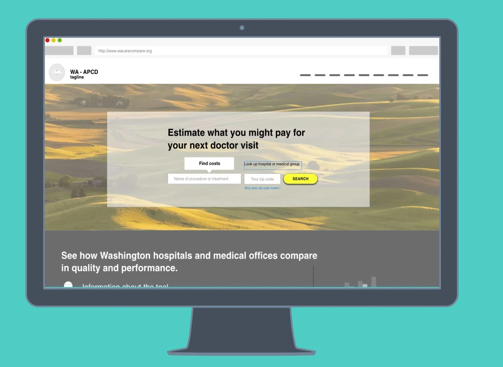
Another version of the early wireframe prototype.
While I left the agency before the WA-APCD would launch, I was able to lead our team and client product owner to a final series of structural designs for the most important user scenario:
User searches for a procedure or a hospital / medical group
User finds procedure or location, and can see pricing comparisons
User understands the information presented.
To see more detailed screenshots of the process, I have a deck here for the curious!
Washington HealthCareCompare has since launched and can be seen here: https://www.wahealthcarecompare.com/. While I didn’t work on the site visuals, much of the initial UX writing and interactions remain intact.